Plot for visualization
Introduction
In this section, we will show how to use function plot_reduceddim() to realize dimension reduction and automatically plot the result.
To get detailed information of the input and output of the function, please check API.
Step 1: Import packages and Read in data
import packages
import anndata as ad
import numpy as np
import pandas as pd
import scDesign3Py
Read in data
The raw data is from the scvelo and we only choose top 30 genes to save time.
data = ad.read_h5ad("data/PANCREAS.h5ad")
data = data[:, 0:30]
data
View of AnnData object with n_obs × n_vars = 2087 × 30
    obs: 'clusters_coarse', 'clusters', 'S_score', 'G2M_score', 'cell_type', 'sizeFactor', 'pseudotime'
    var: 'highly_variable_genes'
    obsm: 'X_pca', 'X_umap', 'X_x_pca', 'X_x_umap'
Step 2: Use scDesign3 class to simulate reads for comparison
# create the instance and set the parallel method
test = scDesign3Py.scDesign3(n_cores=3, parallelization="pbmcmapply", return_py=True)
test.set_r_random_seed(123)

# all-in-one simulation
simu_res = test.scdesign3(
    anndata=data,
    default_assay_name="counts",
    celltype="cell_type",
    pseudotime="pseudotime",
    mu_formula="s(pseudotime, k = 10, bs = 'cr')",
    sigma_formula="s(pseudotime, k = 5, bs = 'cr')",
    family_use="nb",
    usebam=False,
    corr_formula="1",
    copula="gaussian",
)
Step 3: Use the simulated counts to construct the new anndata.AnnData object
Besides constructing the simulated anndata.AnnData object, we can also calculate the log transformed data for visualization.
simu_data = ad.AnnData(X=simu_res["new_count"], obs=simu_res["new_covariate"])
simu_data.layers["log_transformed"] = np.log1p(simu_data.X)
data.layers["log_transformed"] = np.log1p(data.X)
Step 4: Visualization
Please make sure all anndata.AnnData objects provided in ref_anndata and anndata_list has similar assay name structure.
For example, all involved count matrix should all be stored either in anndata.AnnData.X or anndata.AnnData.layers[assay_use] and all share the same name.
plot = scDesign3Py.plot_reduceddim(
    ref_anndata=data,
    anndata_list=simu_data,
    name_list=["Reference", "scDesign3"],
    assay_use="log_transformed",
    if_plot=True,
    color_by="pseudotime",
    n_pc=20,
    point_size=5,
)
If you set if_plot = True, then the return result is a dict with two keys: p_umap and p_pca. Each key hosts a plot plotted by matplotlib.
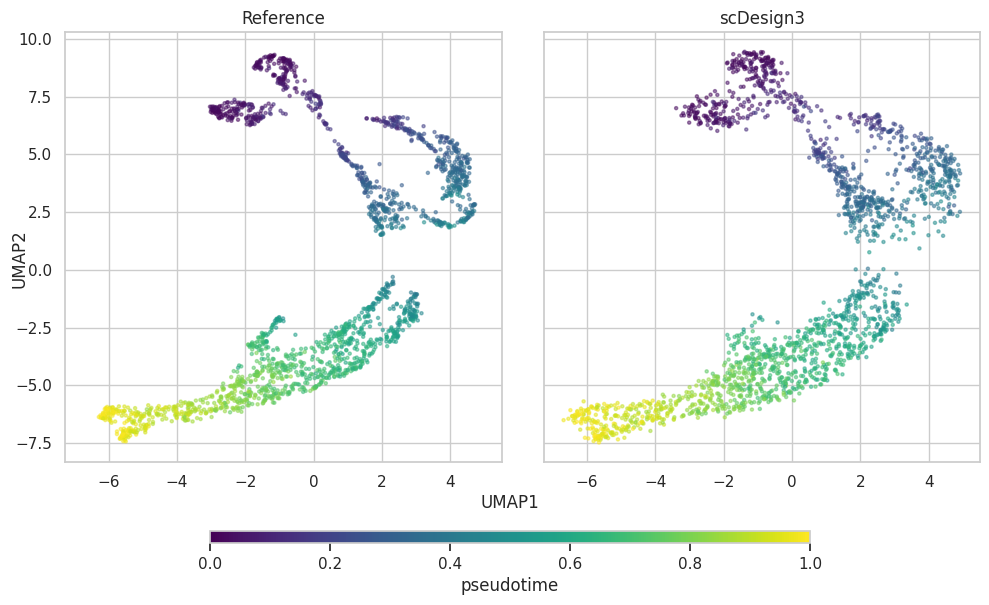
UMAP plot
plot["p_umap"]
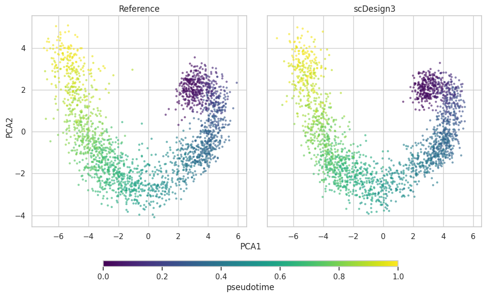
PCA plot
plot["p_pca"]
Alternative to plot
If you are not satisfied with the automatically generated plot result, you can set if_plot = False. Then you will get the dimension reduction result and customize your manipulation.
res = scDesign3Py.plot_reduceddim(
    ref_anndata=data,
    anndata_list=simu_data,
    name_list=["Reference", "scDesign3"],
    assay_use="log_transformed",
    if_plot=False,
    color_by="pseudotime",
    n_pc=20,
    point_size=5,
)
Each row of the output represents a cell (observation). The return PCs number is equal to the set in n_pc.
res[["Method","pseudotime","PC1","PC2","UMAP1","UMAP2"]].head()
| Method | pseudotime | PC1 | PC2 | UMAP1 | UMAP2 | |
|---|---|---|---|---|---|---|
| 1 | Reference | 0.677236 | 2.303983 | 2.020007 | 0.683344 | -3.041574 |
| 2 | Reference | 0.431569 | -2.346135 | 1.611974 | 3.921517 | 1.959380 |
| 3 | Reference | 0.749373 | 3.688469 | 0.252404 | -0.697866 | -4.915706 |
| 4 | Reference | 0.925441 | 6.045197 | -2.888025 | -3.680566 | -5.195340 |
| 5 | Reference | 0.380345 | -3.650479 | 1.347464 | 2.639666 | 2.250414 |