Benchmarking methods for identification of SVG
Introduction
In this example, we will demonstrate how to use scDesign3Py to generate negative control and benchmark methods for identifying spatially variable genes (SVG) from spatial transcriptomics data. Please note that here we only did a very brief benchmarking for illustration purpose, not for formal comparison.
Import packages and Read in data
import pacakges
import anndata as ad
import numpy as np
import pandas as pd
from sklearn.preprocessing import MinMaxScaler
import scDesign3Py

import SpatialDE
Read in data
The raw data is from the Seurat, which is a dataset generated with the Visium technology from 10x Genomics and converted to .h5ad file using the R package sceasy. We pre-select the top spatial variable genes.
To save time, we subset the top 200 genes..
data = ad.read_h5ad("data/VISIUM.h5ad")
data = data[:,0:200]
data
View of AnnData object with n_obs × n_vars = 2696 × 200
    obs: 'nCount_Spatial', 'nFeature_Spatial', 'nCount_SCT', 'nFeature_SCT', 'SCT_snn_res.0.8', 'seurat_clusters', 'spatial1', 'spatial2', 'cell_type'
    var: 'name'
Simulation
We use the step-by-step functions instead of the one-shot function to generate synthetic data since these step-by-step functions allow us to alter estimated parameters and generate new data based on our desired parameters.
example = scDesign3Py.scDesign3(n_cores=3,parallelization="pbmcmapply")
example_data = example.construct_data(
    anndata = data,
    default_assay_name = "counts",
    celltype = "cell_type",
    spatial=["spatial1", "spatial2"],
    corr_formula = "1")
example.set_r_random_seed(123)
example_marginal = example.fit_marginal(
    mu_formula = "s(spatial1, spatial2, bs = 'gp', k= 50)",
    sigma_formula = "1",
    family_use = "nb",
    usebam = False
)
example.set_r_random_seed(123)
example_copula = example.fit_copula()
example_para = example.extract_para()
Here, we examine the mean_mat, which is one of the outputs from the previous function extract_para(). For each gene, we calculate the difference in the between the maximum mean parameter and minimum mean parameter across all cells. We calculate the deviance explained by spatial locations in each regression model, and select the top 50. We regard these genes as spatially variable genes (SVGs). Then, we manually set the mean parameters of the rest genes to be the same across all cells. We regard all genes with the same mean parameter across cells as non-SVG genes. Of course, this is a very flexible step and users may choose other ideas to modify the mean matrix.
dev_explain = pd.Series()
for k,_ in example_marginal.items():
    dev_explain[k] = 1 - example_marginal.rx2(k).rx2("fit").rx2("deviance")[0]/example_marginal.rx2(k).rx2("fit").rx2("null.deviance")[0]
diff_idx = dev_explain.sort_values(ascending=False).index
de_idx = diff_idx[:50]
no_de_idx = diff_idx[50:]
example_para["mean_mat"][no_de_idx] = ((example_para["mean_mat"].max() + example_para["mean_mat"].min())/2)[no_de_idx]
example.set_r_random_seed(123)
example_newcount = example.simu_new(mean_mat=example_para["mean_mat"])
Visualization of simulation results
import matplotlib.pyplot as plt
import seaborn as sns
simu_data = ad.AnnData(X=example_newcount, obs=example_data["newCovariate"])
simu_data.layers["log_transformed"] = np.log1p(simu_data.X)
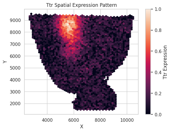
We rescale the log count of 1 synthetic SVG here to the 0 to 1 scale and visualize it below.
Show code cell source
sns.set(style="whitegrid")
gene_name = de_idx[0]
scaler = MinMaxScaler()
plt.scatter(
        simu_data.obs["spatial1"],
        simu_data.obs["spatial2"],
        c=scaler.fit_transform(np.log1p(simu_data[:,gene_name].X)),
        alpha=1,
        s=20,
    )
plt.xlabel('X')
plt.ylabel('Y')
plt.title(f"{gene_name} Spatial Expression Pattern")
plt.colorbar(label=f"{gene_name} Expression",)
plt.show()
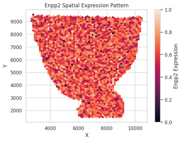
We also rescale the log count of 1 synthetic non-SVG here to the 0 to 1 scale and visualize it below.
Show code cell source
sns.set(style="whitegrid")
gene_name = no_de_idx[0]
scaler = MinMaxScaler()
plt.scatter(
        simu_data.obs["spatial1"],
        simu_data.obs["spatial2"],
        c=scaler.fit_transform(np.log1p(simu_data[:,gene_name].X)),
        alpha=1,
        s=20,
    )
plt.xlabel('X')
plt.ylabel('Y')
plt.title(f"{gene_name} Spatial Expression Pattern")
plt.colorbar(label=f"{gene_name} Expression",)
plt.show()
SVG identification
Now, we use the simulated data to benchmark the performance of SpatialDE, a SVG identification method as an example.
qvals = pd.DataFrame(index=simu_data.var_names)
methods = ['SpatialDE']
result = SpatialDE.run(simu_data.obs[["spatial1","spatial2"]],example_newcount)
result.index = result["g"]
qvals["SpatialDE"] = result.loc[simu_data.var_names,"qval"]
Since we manually created non-SVG in the extra_para() step, now we can calculate the actual false discovery proportion(FDP) and power of the tests we conducted above with various target FDR threshold.
targetFDR = np.concatenate([np.arange(0.01,0.11,0.01),np.arange(0.2,0.6,0.1)])
fdp = pd.DataFrame(index=targetFDR,columns=methods)
power = pd.DataFrame(index=targetFDR,columns=methods)

for method in methods:
    curr_p = qvals[method]
    for threshold in targetFDR:
        discovery = curr_p[curr_p <= threshold]
        true_positive = discovery.index.intersection(de_idx).shape[0]

        if len(discovery) == 0:
            fdp.loc[threshold,method] = 0
        else:
            fdp.loc[threshold,method] = (len(discovery) - true_positive)/len(discovery)

        power.loc[threshold,method] = true_positive/de_idx.shape[0]
Visualization
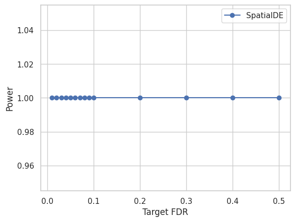
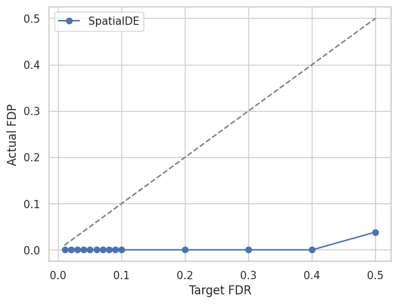
We visualize the Target FDR vs Actual FDP and Target FDR vs Power below.
Show code cell source
for method in methods:
    plt.plot(targetFDR,fdp[method],"o-",label=method)

plt.plot(targetFDR, targetFDR, '--', color='gray')
plt.xlabel('Target FDR')
plt.ylabel('Actual FDP')
plt.legend(loc="best")
plt.show()
Show code cell source
for method in methods:
    plt.plot(targetFDR,power[method],"o-",label=method)

plt.xlabel('Target FDR')
plt.ylabel('Power')
plt.legend(loc="best")
plt.show()