Simulate CITE-seq data
Introduction
In this example, we show how to use scDesign3Py to simulate CITE-seq data and illustrate the similarity between the inputted reference data and synthetic data.
Import packages and Read in data
import pacakges
import anndata as ad
import numpy as np
import pandas as pd
from sklearn.decomposition import PCA
from sklearn.preprocessing import MinMaxScaler
import umap
import scDesign3Py
Read in the reference data
data = ad.read_h5ad("data/CITE.h5ad")
To save computational time, we only use the top 100 genes and six more genes with protein and RNA abundance information.
keep_gene = ["CD4", "CD14", "CD19", "CD34", "CD3E", "CD8A"]
keep_adt = ["ADT_CD4", "ADT_CD14", "ADT_CD19", "ADT_CD34", "ADT_CD3", "ADT_CD8"]
keep = keep_gene + keep_adt
idx = keep + data.var_names.tolist()[:100]
data = data[:, idx]
data.layers["log"] = np.log1p(data.X)
data
AnnData object with n_obs × n_vars = 8617 × 112
    obs: 'nCount_RNA', 'nFeature_RNA', 'RNA_snn_res.0.8', 'seurat_clusters', 'nCount_ADT', 'ident', 'cell_type'
    var: 'name'
    layers: 'log'
Simulation
We input the reference data and use the one-shot function to simulate CITE-seq dat using discrete cell types as the covariates for fitting each gene’s marginal distribution.
test = scDesign3Py.scDesign3(n_cores=3,parallelization="pbmcmapply")
test.set_r_random_seed(123)
simu_res = test.scdesign3(
    anndata=data,
    default_assay_name="counts",
    celltype="cell_type",
    mu_formula="cell_type",
    sigma_formula="cell_type",
    family_use="nb",
    usebam=False,
    corr_formula="cell_type",
    copula="vine",
    nonnegative=True,
    nonzerovar=True,
)
After the simulation, we can create the AnnData object using the synthetic count matrix and store the logcounts to the input and synthetic AnnData objects.
simu_data = ad.AnnData(
    X=simu_res["new_count"], obs=simu_res["new_covariate"], layers={"log": np.log1p(simu_res["new_count"])}
)
Then, we obtained the PCA and UMAP for both the inputted reference data and the synthetic data. These sets of embedding will be used for the visualization below.
reducer_umap = umap.UMAP(n_neighbors=15, min_dist=0.1)
reducer_pca = PCA(n_components=50, whiten=False)
reducer_pca.fit(data.layers["log"].toarray())
org_pca = reducer_pca.transform(data.layers["log"].toarray())
simu_pca = reducer_pca.transform(simu_data.layers["log"])
reducer_umap.fit(org_pca)
org_umap = reducer_umap.transform(org_pca)
simu_umap = reducer_umap.transform(simu_pca)
Visualization
To visualize the results, we select six genes and reformat their UMAP embedding we got in the previous step.
scaler = MinMaxScaler()
org_data = pd.DataFrame(
    np.concatenate([org_umap, scaler.fit_transform(data.layers["log"].toarray()[:, 0:12])], axis=1),
    columns=["UMAP1", "UMAP2"]
    + ["CD4", "CD14", "CD19", "CD34", "CD3", "CD8"]
    + ["ADT_CD4", "ADT_CD14", "ADT_CD19", "ADT_CD34", "ADT_CD3", "ADT_CD8"],
)
simu_data = pd.DataFrame(
    np.concatenate([simu_umap, scaler.fit_transform(simu_data.layers["log"][:, 0:12])], axis=1),
    columns=["UMAP1", "UMAP2"]
    + ["CD4", "CD14", "CD19", "CD34", "CD3", "CD8"]
    + ["ADT_CD4", "ADT_CD14", "ADT_CD19", "ADT_CD34", "ADT_CD3", "ADT_CD8"],
)
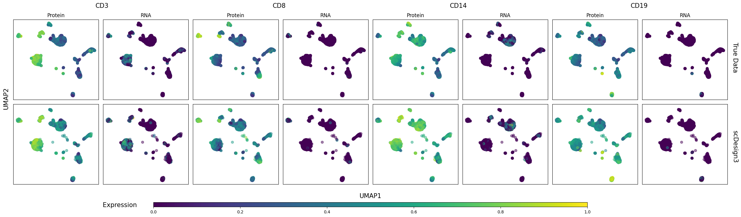
Six genes’ protein and RNA abundances are shown on the cell UMAP embeddings in the inputted reference data and the synthetic data below.
import matplotlib.pyplot as plt
import matplotlib as mpl
Show code cell source
fig, axes = plt.subplots(2, 8, figsize=(8 * 3, 2 * 3), sharey=True, sharex=True)
colors = plt.get_cmap("viridis")
norm = plt.Normalize(vmax=1, vmin=0)

for i, name in enumerate(
    ["CD3_Protein", "CD3_RNA", "CD8_Protein", "CD8_RNA", "CD14_Protein", "CD14_RNA", "CD19_Protein", "CD19_RNA"]
):
    for j, assay in enumerate(["True Data", "scDesign3"]):
        ax = axes[j][i]
        ax.set_xticks([])
        ax.set_yticks([])
        type = name.split("_")[1]
        gene = name.split("_")[0]
        if type == "Protein":
            gene = "ADT_" + gene
        if assay == "True Data":
            dat = org_data[["UMAP1", "UMAP2", gene]]
            ax.set_title(type)
        else:
            dat = simu_data[["UMAP1", "UMAP2", gene]]

        ax.scatter(dat["UMAP1"], dat["UMAP2"], c=dat[gene], alpha=0.5)

fig.tight_layout()
fig.text(0.5, -0.05, "UMAP1", ha="center", fontsize=15)
fig.text(-0.008, 0.5, "UMAP2", va="center", rotation="vertical", fontsize=15)
fig.text(1, 0.65, "True Data", fontsize=15, rotation=270)
fig.text(1, 0.15, "scDesign3", fontsize=15, rotation=270)

fig.text(0.12, 1.003, "CD3", fontsize=15)
fig.text(0.365, 1.003, "CD8", fontsize=15)
fig.text(0.61, 1.003, "CD14", fontsize=15)
fig.text(0.86, 1.003, "CD19", fontsize=15)

position = fig.add_axes([0.2, -0.1, 0.60, 0.025])
fig.colorbar(mpl.cm.ScalarMappable(norm=norm, cmap=colors), cax=position, orientation="horizontal")
fig.text(0.13, -0.1, "Expression", fontsize=15)

plt.show()