Simulate spatial transcriptomic data
Introduction
In this example, we show how to use scDesign3Py to simulate the single-cell spatial data.
Import packages and Read in data
import pacakges
import anndata as ad
import numpy as np
import pandas as pd
import scDesign3Py
Read in the reference data
The raw data is from the Seurat, which is a dataset generated with the Visium technology from 10x Genomics. We pre-select the top spatial variable genes. To save time, we only use the top 10 genes.
data = ad.read_h5ad("data/VISIUM.h5ad")
data = data[:,0:10]
data
View of AnnData object with n_obs × n_vars = 2696 × 10
    obs: 'nCount_Spatial', 'nFeature_Spatial', 'nCount_SCT', 'nFeature_SCT', 'SCT_snn_res.0.8', 'seurat_clusters', 'spatial1', 'spatial2', 'cell_type'
    var: 'name'
Simulation
Then, we can use this spatial dataset to generate new data by setting the parameter mu_formula as a smooth terms for the spatial coordinates.
test = scDesign3Py.scDesign3(n_cores=3,parallelization="pbmcmapply")
test.set_r_random_seed(123)
simu_res = test.scdesign3(
    anndata = data,
    default_assay_name = "counts",
    celltype = "cell_type",
    spatial = ["spatial1", "spatial2"],
    mu_formula = "s(spatial1, spatial2, bs = 'gp', k= 400)",
    sigma_formula = "1",
    family_use = "nb",
    usebam = False,
    corr_formula = "1",
    copula = "gaussian",
  )
Then we can construct new data using the simulated count matrix.
simu_data = ad.AnnData(X=simu_res["new_count"], obs=simu_res["new_covariate"])
simu_data.layers["log_transformed"] = np.log1p(simu_data.X)
Visualization
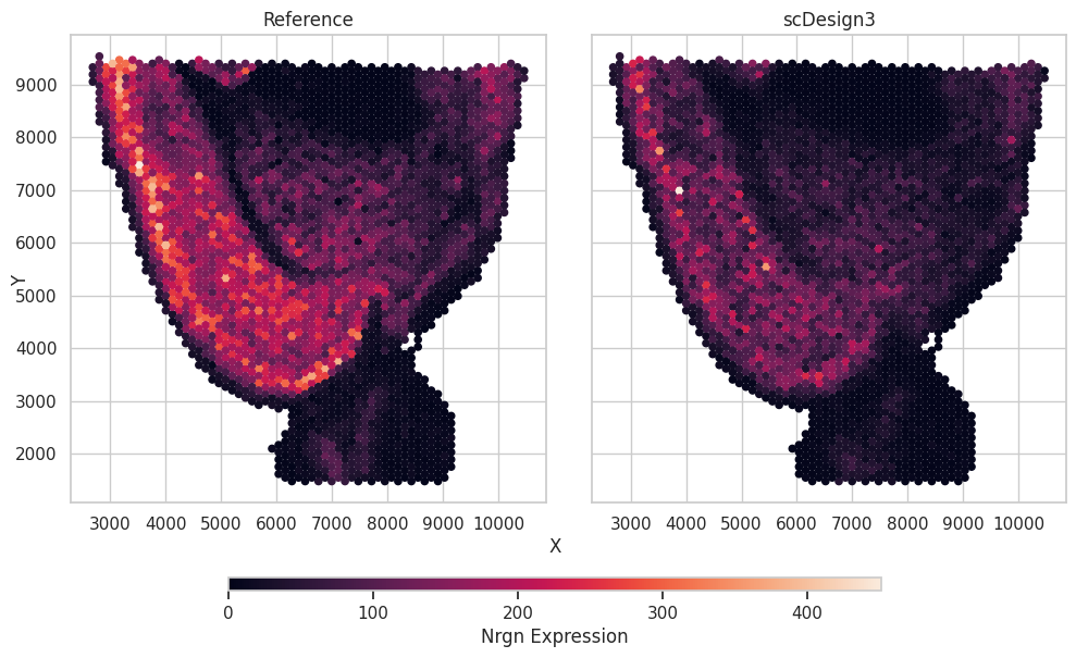
We plot a selected gene as an example showing the gene expression and the spatial locations.
import matplotlib.pyplot as plt
import seaborn as sns
Show code cell source
gene_name = "Nrgn"

df = pd.concat([data.obs[["spatial1","spatial2"]],simu_data.obs[["spatial1","spatial2"]]],axis=0)
df["Expression"] = np.concatenate([data[:,gene_name].X.toarray().flatten(),simu_data[:,gene_name].X.toarray().flatten()])
df["Method"] = ["Reference"]*data.n_obs + ["scDesign3"]*simu_data.n_obs


# plot
sns.set(style="whitegrid")
methods = df.groupby("Method")
fig, axes = plt.subplots(1, len(methods), figsize=(len(methods) * 5, 1 * 5), sharey=True, sharex=True)
fig.tight_layout()

for i, (method, exp) in enumerate(methods):
    ax = axes[i]

    scatter = ax.scatter(
        exp["spatial1"],
        exp["spatial2"],
        c=exp["Expression"],
        alpha=1,
        s=20,
    )
    ax.set_title(method)

fig.text(0.5, 0, "X", ha="center")
fig.text(0, 0.5, "Y", va="center", rotation="vertical")
position = fig.add_axes([0.2, -0.07, 0.60, 0.025])
fig.colorbar(scatter,                cax=position,
                orientation="horizontal",
                label=f"{gene_name} Expression",)
fig.show()