Simulate spatial transcriptomic data
Introduction
In this example, we show how to use scDesign3Py to simulate the spot-resolution spatial data, which each spot is a mix of cells from different cell types.
Import packages and Read in data
import pacakges
import anndata as ad
import pandas as pd
import numpy as np
import scDesign3Py

import cell2location
Read in the reference data
The paired scRNA-seq and spatial data were used in CARD. We pre-select the top cell-type marker genes.
MOBSC_exp = ad.read_h5ad("data/MOBSC.h5ad")
MOBSP_exp = ad.read_h5ad("data/MOBSP.h5ad")
MOBSC_exp
AnnData object with n_obs × n_vars = 12640 × 182
    obs: 'cellType', 'sampleInfo', 'sizeFactor', 'cell_type'
    var: 'rownames.count.'
MOBSP_exp
AnnData object with n_obs × n_vars = 278 × 182
    obs: 'spatial1', 'spatial2'
    var: 'name'
cell_type = MOBSC_exp.obs["cellType"].unique()
Simulation
We first use scDesign3Py to estimate the cell-type reference from scRNA-seq data.
mobsc = scDesign3Py.scDesign3(n_cores=3,parallelization="pbmcmapply")
mobsc.set_r_random_seed(123)
MOBSC_data = mobsc.construct_data(
    anndata=MOBSC_exp,
    default_assay_name="counts",
    celltype="cell_type",
    corr_formula="1"
)
MOBSC_marginal = mobsc.fit_marginal(
    mu_formula = "cell_type",
    sigma_formula = "cell_type",
    family_use="nb",
    usebam=False
)
MOBSC_copula = mobsc.fit_copula()
MOBSC_para = mobsc.extract_para()
MOBSC_newcount = mobsc.simu_new()
mobsp = scDesign3Py.scDesign3(n_cores=3,parallelization="pbmcmapply")
mobsp.set_r_random_seed(123)
MOBSP_data = mobsp.construct_data(
    anndata=MOBSP_exp,
    default_assay_name="counts",
    spatial=["spatial1", "spatial2"],
    corr_formula="1"
)
MOBSP_marginal = mobsp.fit_marginal(
    mu_formula = "s(spatial1, spatial2, bs = 'gp', k = 50, m = c(1, 2, 1))",
    sigma_formula = "1",
    family_use="nb",
    usebam=False
)
MOBSP_copula = mobsp.fit_copula()
MOBSP_para = mobsp.extract_para()
Deconvolution
Now we get the fitted models for scRNA-seq and spatial data. We need to extract their mean parameters (i.e., expected expression values).
MOBSC_sig_matrix = pd.DataFrame(index = MOBSC_para["mean_mat"].columns)
for t in cell_type:
    cell = MOBSC_exp.obs[MOBSC_exp.obs["cell_type"]==t].index
    MOBSC_sig_matrix[t] = MOBSC_para["mean_mat"].loc[cell,:].mean().T
mixture_file = ad.AnnData(MOBSP_para["mean_mat"])
mixture_file.X = np.round(mixture_file.X)
We use cell2location to decompose each spot’s expected expression into cell-type proportions. This step is to set the true cell-type proportions. Please note you can also use other decomposition methods or set the proportion mannully if you have your own design.
cell2location.models.Cell2location.setup_anndata(adata=mixture_file)
mod = cell2location.models.Cell2location(
    adata = mixture_file,
    cell_state_df=MOBSC_sig_matrix,
)
mod.train(max_epochs=1000)
mixture_file = mod.export_posterior(mixture_file, sample_kwargs={"num_samples":1000, "batch_size":mod.adata.n_obs,"use_gpu":True})
Then we can simulate new spatial data where each spot is the sum of 50 cells/5 (therefore on average 10 cells per spot). Increasing the number of cells will make the spatial data smoother (closer to the expected spatial expression).
abundance = mixture_file.obsm['q05_cell_abundance_w_sf']
abundance.columns = cell_type
percent = abundance.div(abundance.sum(axis=1), axis=0)
# simu single cell data
simu_data = ad.AnnData(X=MOBSC_newcount,obs=MOBSC_exp.obs)

# simu mixture data
mixture = []
for spot in MOBSP_exp.obs_names:
    n = 50
    count = pd.Series(0,index=MOBSC_exp.var_names)
    for t in cell_type:
        tmp = simu_data[simu_data.obs["cell_type"]==t, ]
        index = tmp.obs.sample(n=n).index
        count_t = MOBSC_newcount.loc[index, ].sum() * percent.loc[spot,t]
        count = count + count_t
    count.name = spot
    mixture.append(count)
mixture = pd.concat(mixture,axis=1).T
mixture = mixture / 5
mixture = np.ceil(mixture)

simu_mixture = ad.AnnData(X=mixture, obs=MOBSP_exp.obs)
Visualization
import matplotlib.pyplot as plt
import seaborn as sns
from matplotlib.patches import Patch
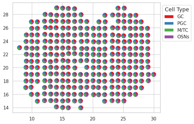
We can visualzie the proportions by pie-chart.
Show code cell source
sns.set(style="whitegrid")

def drawPieMarker(xs, ys, ratios, sizes, colors):
    markers = []
    previous = 0
    # calculate the points of the pie pieces
    for color, ratio in zip(colors, ratios):
        this = 2 * np.pi * ratio + previous
        x  = [0] + np.cos(np.linspace(previous, this, 10)).tolist() + [0]
        y  = [0] + np.sin(np.linspace(previous, this, 10)).tolist() + [0]
        xy = np.column_stack([x, y])
        previous = this
        markers.append({'marker':xy, 's':np.abs(xy).max()**2*np.array(sizes), 'facecolor':color})

    # scatter each of the pie pieces to create pies
    for marker in markers:
        ax.scatter(xs, ys, **marker)

colors = ["#e41a1c","#377eb8","#4daf4a","#984ea3"]

fig, ax = plt.subplots()

for spot in MOBSP_exp.obs_names:
    drawPieMarker(xs=MOBSP_exp.obs["spatial1"][spot],
                ys=MOBSP_exp.obs["spatial2"][spot],
                ratios=percent.loc[spot,:].to_list(),
                sizes=120,
                colors=colors
                )

legend_elements = [Patch(facecolor=colors[i], label=cell_type[i]) for i in range(len(cell_type))]
legend = plt.legend(handles=legend_elements,loc='upper left', bbox_to_anchor=(1, 1))
legend.set_title('Cell Type', prop={'size': 13})

plt.show()
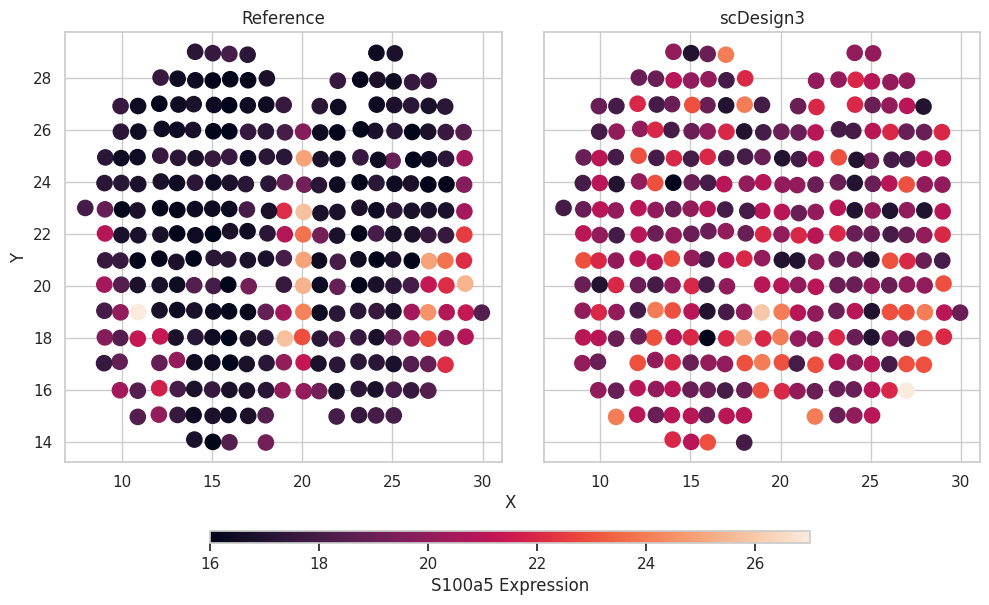
We can also check the simulated results. We use one cell-type marker genes as the example.
Show code cell source
gene_name = "S100a5"

df = pd.concat([MOBSP_exp.obs[["spatial1","spatial2"]],simu_mixture.obs[["spatial1","spatial2"]]],axis=0)
df["Expression"] = np.concatenate([MOBSP_exp[:,gene_name].X.flatten(),simu_mixture[:,gene_name].X.flatten()])
df["Method"] = ["Reference"]*MOBSP_exp.n_obs + ["scDesign3"]*MOBSP_exp.n_obs

# plot
sns.set(style="whitegrid")
methods = df.groupby("Method")
fig, axes = plt.subplots(1, len(methods), figsize=(len(methods) * 5, 1 * 5), sharey=True, sharex=True)
fig.tight_layout()

for i, (method, exp) in enumerate(methods):
    ax = axes[i]

    scatter = ax.scatter(
        exp["spatial1"],
        exp["spatial2"],
        c=exp["Expression"],
        alpha=1,
        s=120,
    )
    ax.set_title(method)

fig.text(0.5, 0, "X", ha="center")
fig.text(0, 0.5, "Y", va="center", rotation="vertical")
position = fig.add_axes([0.2, -0.07, 0.60, 0.025])
fig.colorbar(scatter,                cax=position,
                orientation="horizontal",
                label=f"{gene_name} Expression",)
fig.show()